11 March
11 March · 03:24 UTC
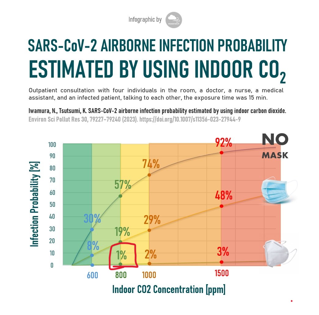
Nice graphic showing risk of Covid infection based on how much ventilation (measured by CO2 levels) you have and what type of mask you use (or no mask). Have put a red square where I've been for the past 4-5 years, through deliberate design of my workplace and social events. I have a small CO2 meter I can use to test with. You can see how good P2/N95 masks are, that the infection risk is only 3% even with very poor ventilation.
Nick Dee added a new photo.
1 media reference recorded in the export