25 March
25 March · 19:54 UTC
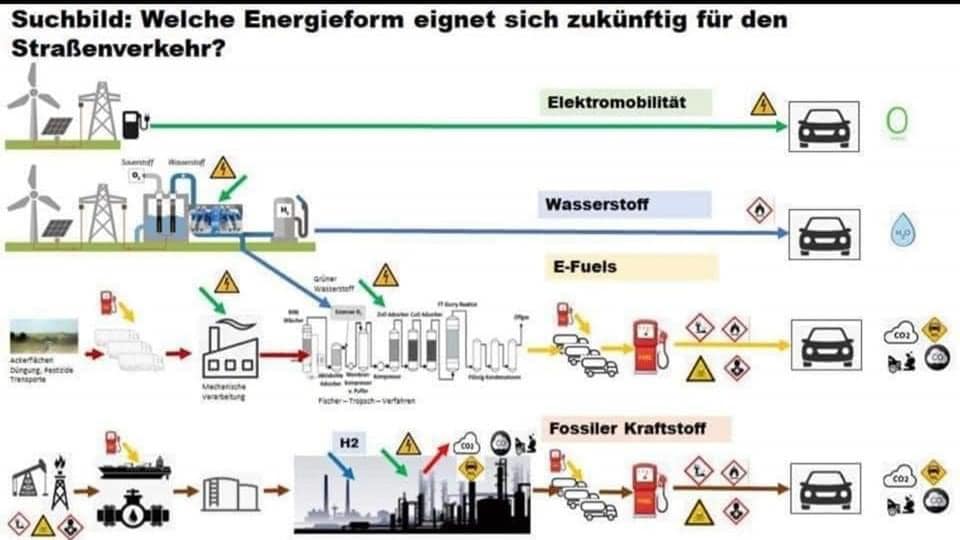
If your German is no good, what this diagram shows is the network of infrastructure needed to get energy into your car, for the current fuelling options. To the right of each car is the outputs (pollution). EVs at the top. Then hydrogen. Then biofuels. Then petrol/diesel. I think the message is clear. We’re using the hardest, most expensive and most damaging option right now. (P.S. for the EVs, not even the transmission tower or fast-charger shown is needed, if you charge using your own solar.)
Nick Dee added a new photo.
1 media reference recorded in the export